


Published on: September 26, 2025 | Updated on: September 26, 2025
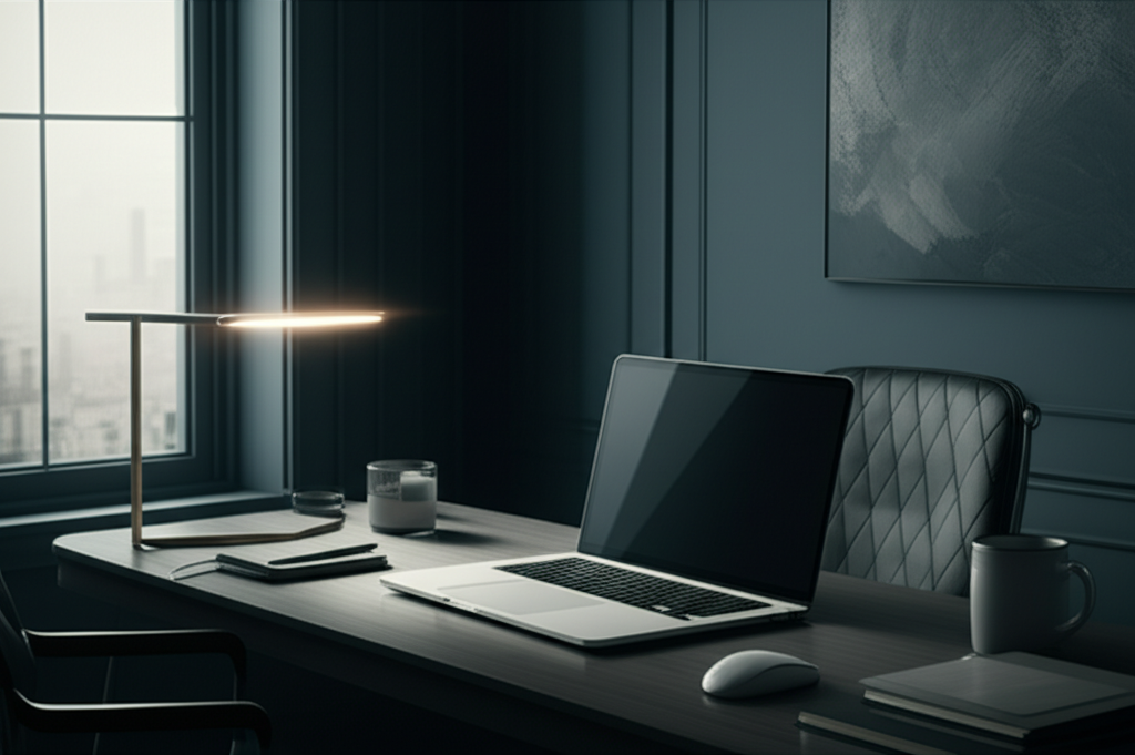
Embrace the power of stormy color palette office ideas to create a sophisticated, focused, and inspiring workspace. Discover essential elements like deep blues, charcoal grays, and accent colors that foster concentration and elevate your home office design.
A home office should be a sanctuary for productivity and creativity, but sometimes, the blank canvas can feel overwhelming. If you’re looking to infuse your workspace with a sense of calm focus and sophisticated style, a stormy color palette might be your perfect solution. This approach uses deep, moody hues to create an environment that’s both stimulating and grounding. We’ll explore how to harness these powerful colors to transform your office into your most productive space yet.
Why Choose a Stormy Color Palette for Your Home Office?

Opting for a stormy color palette for your home office isn’t just about aesthetics; it’s a strategic choice that can profoundly impact your mood and productivity. These deep, often cool tones are known for their ability to reduce visual clutter and promote a sense of calm, making them ideal for focused work. Let’s delve into the psychology behind these captivating hues and why they are a smart choice for your workspace.
The psychological impact of color is well-documented, and darker, more muted tones like those found in a stormy palette can actually enhance concentration. They create a sense of depth and enclosure, which can make your workspace feel more intimate and less distracting. This can be particularly beneficial if your office space is part of a larger, more open living area. Embracing these colors can transform your office from a mere functional room into a haven of focused energy.
Understanding the Core Hues of a Stormy Palette
At the heart of a stormy color palette lie shades that evoke the dramatic beauty of an approaching storm. Think deep indigos, charcoal grays, slate blues, and even hints of deep forest greens or rich plums. These are not bright, jarring colors, but rather sophisticated, grounding tones that create a sense of stability and depth. Understanding these core hues is the first step to building a cohesive and impactful design.
These colors work by absorbing light rather than reflecting it brightly, which can create a cozy and enveloping atmosphere. They offer a sophisticated backdrop that allows other elements in your office, like artwork or functional accessories, to truly stand out. By grounding your space with these rich tones, you create a foundation for both visual appeal and enhanced focus.
Key Elements for a Stormy Color Palette Office
When designing an office with a stormy color palette, the goal is to create a balanced and inviting atmosphere. This involves carefully selecting furniture, lighting, and accessories that complement the core colors. We’ll break down the essential elements that will bring your stormy-hued workspace to life, ensuring both style and functionality.
The right combination of elements will ensure your stormy office feels sophisticated and inspiring, not dim or oppressive. It’s about using these powerful colors as a foundation to build a space that supports your work and well-being.
Walls: The Foundation of Your Stormy Sanctuary
Your walls are the largest canvas in your office, and choosing the right shade can set the entire mood. Opting for deep blues, charcoal grays, or even a muted slate can instantly create a sense of depth and sophistication. These colors act as a powerful backdrop, making other design elements pop and fostering an environment conducive to deep work.
Consider a rich, deep navy blue for a classic yet impactful look, or a soft charcoal gray for a more modern and minimalist feel. If you’re feeling adventurous, a deep plum or a dark teal can add a unique and luxurious touch. The key is to select a shade that feels enveloping and conducive to concentration, avoiding anything too bright or distracting.
Furniture: Anchoring Your Workspace in Style
Furniture is where functionality meets form in your stormy office. Think about pieces that echo the depth and sophistication of your chosen wall color. Dark wood tones, black metal accents, and upholstered furniture in deep blues, grays, or even rich greens can anchor your space beautifully. An ergonomic chair in a complementary dark fabric is a must-have for comfort and support.
A minimalist desk in a dark wood finish or a sleek black metal frame can enhance the modern feel. If you opt for a lighter desk, balance it with darker accessories or seating. The aim is to create a cohesive look where furniture pieces feel integrated with the overall color scheme, contributing to a sense of order and purpose.
Lighting: Illuminating the Moody Ambiance
While stormy colors can evoke depth, proper lighting is crucial to prevent your office from feeling too dark or cavernous. Layering your lighting is key: ambient light from a stylish ceiling fixture, task lighting from a sleek desk lamp, and accent lighting to highlight artwork or plants. Warm-toned bulbs are generally preferred to complement the cool, deep hues of the palette.
A dimmer switch on your main light source can offer flexibility, allowing you to adjust the mood from bright and energizing to soft and contemplative. Consider incorporating metallic accents in your lighting fixtures, such as brushed brass or matte black, to add a touch of elegance and reflect light subtly. Good lighting enhances the mood and improves visibility for detailed tasks.
Flooring: Grounding Your Space with Texture and Tone
Your flooring plays a significant role in grounding your stormy color palette office. Darker carpets or rugs in shades of charcoal, deep gray, or even a muted navy can enhance the sense of depth and provide a cozy feel underfoot. For a more modern aesthetic, consider dark hardwood or even polished concrete.
If your walls are a very dark shade, a slightly lighter, textured rug can add visual interest and prevent the space from feeling too monochromatic. Conversely, if your walls are a mid-tone stormy color, a darker rug will create a strong anchor. The right flooring ties the entire room together, adding both comfort and visual stability.
Décor and Accessories: Adding Personality and Polish
This is where you inject your personality and fine-tune the stormy atmosphere. Think about accent pieces that offer a contrast or complement the deep hues. Metallic finishes like brushed gold, copper, or matte black can add a touch of luxury and sparkle. Artwork featuring abstract designs with pops of lighter colors or serene landscapes can break up the darker tones beautifully.
Consider incorporating natural elements like plants in dark ceramic pots or wooden accents to add warmth and life. Books with dark or metallic covers can also contribute to the overall aesthetic. Even stationery and desk organizers in complementary colors can enhance the cohesive feel of your stormy office.
Inspiring Stormy Color Palette Combinations
The beauty of a stormy color palette lies in its versatility and the myriad of sophisticated combinations it allows. Moving beyond a single shade, layering different moody tones creates depth and visual interest, transforming your office into a truly unique and inspiring space. Here are a few combinations to spark your creativity.
These combinations offer different moods and levels of intensity, allowing you to tailor the stormy palette to your personal preferences and the specific needs of your workspace. Experimenting with these ideas can lead to surprisingly dynamic and functional designs.
Deep Indigo and Charcoal Gray: Classic Sophistication
This pairing is a timeless choice for a reason. Deep indigo walls create a sense of calm and focus, while charcoal gray furniture or accents add a grounding, sophisticated element. This combination is perfect for those who want a workspace that feels both professional and serene.
Imagine rich navy walls, a comfortable charcoal gray ergonomic chair, and a sleek black desk. Add accents of brushed silver or a deep emerald green in artwork or a decorative vase to introduce subtle contrast. This creates an environment that’s both stimulating for work and relaxing for your mind.
Slate Blue and Warm Wood Tones: Natural Depth
Combining the cool, muted tones of slate blue with the warmth of natural wood creates a balanced and inviting atmosphere. This combination feels grounded and organic, perfect for a home office where comfort is paramount. Slate blue can be used on walls or as a primary furniture color, complemented by medium to dark wood finishes.
Consider a slate blue accent wall behind your desk, paired with a solid oak or walnut desk and shelving. A woven rug with subtle blue and brown tones can tie the elements together. This pairing brings a touch of nature indoors, fostering a sense of calm and productivity.
Muted Teal and Deep Plum: Boldly Elegant
For those who want to embrace a more adventurous stormy palette, muted teal and deep plum offer a bold yet elegant combination. These jewel tones add a touch of luxury and intrigue to your workspace. They work well together as accents or even as primary colors, depending on your preference for intensity.
You could feature a deep plum desk with a muted teal upholstered chair, or vice versa. Artwork that incorporates both shades, perhaps with hints of metallic gold, would tie this scheme together beautifully. This combination creates a sophisticated and inspiring environment that encourages creative thinking.
Integrating Ergonomics with a Stormy Palette
A beautiful office is only truly functional if it supports your physical well-being. Integrating ergonomic principles with a stormy color palette ensures your workspace is not only stylish but also promotes health and reduces strain. The deep, calming hues can actually enhance the focus on comfort and proper posture.
When selecting ergonomic furniture, look for pieces that naturally fit into your chosen stormy color scheme. Darker upholstery fabrics for chairs and sofas often come in rich blues, grays, and blacks, which align perfectly. Even the materials and finishes of standing desks or monitor arms can complement the moody aesthetic.
Ergonomic Chairs: Comfort in Deep Hues
Your chair is arguably the most critical piece of ergonomic furniture. Fortunately, many high-quality ergonomic chairs come in dark, sophisticated colors that fit a stormy palette perfectly. Think of a sleek black mesh chair, a deep charcoal fabric executive chair, or even a rich navy blue task chair.
Prioritize features like adjustable lumbar support, armrests, and seat depth. The color should be the final touch, ensuring it harmonizes with your office’s overall design. A well-chosen ergonomic chair in a stormy hue provides comfort and contributes to the visual depth of your workspace.
Standing Desks: A Foundation of Focus
Standing desks offer incredible health benefits and can be seamlessly integrated into a stormy color scheme. Many standing desks are available with dark wood veneers, black frames, or even matte gray finishes. These options complement deep wall colors and rich upholstery beautifully.
Consider a standing desk with a dark walnut or espresso finish to add warmth. Alternatively, a matte black frame and tabletop can provide a sharp, modern contrast against lighter stormy walls. The versatility of standing desks allows them to be a functional and stylish anchor for your productive sanctuary.
Enhancing Productivity with Stormy Office Accessories
Once the core elements are in place, it’s time to focus on accessories that enhance both productivity and the overall stormy aesthetic. These smaller touches can make a big difference in how your workspace feels and functions. They are opportunities to add personality and practical solutions that support your work habits.
Thoughtful accessory choices can elevate your stormy office from merely decorated to truly optimized. They are the finishing touches that make the space uniquely yours and highly effective for your daily tasks.
Desk Organization: Streamlining Your Workflow
A cluttered desk can be a major productivity killer, regardless of your color palette. For a stormy office, opt for desk organizers in materials like matte black metal, dark wood, or even deep gray acrylic. This keeps your essentials tidy while maintaining the sophisticated, moody ambiance.
Consider minimalist trays, pen holders, and cable management solutions. Even your computer monitor or laptop can complement the theme if you choose darker finishes. A well-organized desk space in a stormy palette promotes a clear mind and focused attention on your work.
Stationery and Supplies: Subtle Color Integration
Even your everyday stationery can contribute to your stormy color palette office. Stock up on notebooks, pens, and folders in shades of deep blue, charcoal, or dark gray. You might even find planners or calendars with sophisticated, muted designs that fit the theme.
This small detail reinforces the cohesive atmosphere and makes even mundane tasks feel more pleasant. When everything in your workspace aligns, it creates a subtle but powerful sense of order that can boost your focus and motivation.
Art and Décor: Adding Depth and Inspiration
Art is a powerful tool for personalizing your office and can be used to enhance the stormy color palette. Look for pieces that feature abstract designs with deep blues, grays, and subtle pops of lighter colors. Landscapes with dramatic skies or serene, moody forest scenes can also be excellent choices.
Metallic accents in frames or matting can add a touch of elegance and reflect light subtly. Consider incorporating decorative items like dark ceramic vases, sculptural pieces in matte black, or even a well-placed dark-toned throw blanket on a chair for added texture and warmth.
Bringing the Outdoors In: Natural Touches
Even within a sophisticated stormy palette, incorporating natural elements can prevent the space from feeling too enclosed or stark. Plants add life, texture, and a touch of organic color that beautifully contrasts with deep hues. Choosing the right plants and planters can enhance your stormy office’s aesthetic.
Opt for plants with deep green foliage that will stand out against charcoal or navy walls. Consider planters in dark ceramic, matte black, or even distressed concrete to complement the palette. This brings a sense of calm and connection to nature, which is vital for well-being.
Plant Choices for a Stormy Office
Some plants naturally lend themselves to a moody aesthetic. Snake plants, ZZ plants, and cast iron plants are known for their resilience and deep green or blackish foliage, fitting perfectly into a stormy palette. Even a peace lily with its elegant dark leaves can be a striking addition.
When selecting plants, consider their mature size and light requirements to ensure they thrive in your office environment. Their presence adds a layer of natural beauty and a calming visual element that softens the deeper tones.
Planter Selection: The Perfect Complement
The planter is just as important as the plant itself when it comes to aesthetics. Dark, matte finishes are ideal for a stormy palette. Think of textured ceramic pots in charcoal or deep gray, sleek black cylinders, or even weathered concrete planters.
These choices ensure the planters enhance, rather than detract from, your carefully curated color scheme. They provide a sophisticated vessel for your greenery, grounding the natural element within the overall design.
Lighting Considerations for a Stormy Workspace
While we touched on lighting earlier, it’s worth emphasizing its critical role in a stormy color palette office. These deep hues absorb light, so strategic illumination is key to maintaining a bright, functional, and inviting atmosphere without compromising the moody aesthetic. Layering light sources is the most effective approach.
The right lighting can transform a potentially dim space into a dynamic and energizing work environment. It prevents the stormy colors from feeling overwhelming and instead highlights their sophisticated depth.
Ambient Lighting: Setting the Mood
Ambient lighting provides the overall illumination for your office. A stylish ceiling fixture with a dimmer switch is ideal. Opt for fixtures with dark metal finishes or glass shades that diffuse light softly. Warm-toned LED bulbs (around 2700K-3000K) will cast a cozy glow that complements deep colors.
Avoid harsh, cool-toned lights, which can make deep blues and grays feel sterile. The goal is to create a comfortable, enveloping light that sets a calm and focused mood for your workspace.
Task Lighting: Precision for Productivity
Task lighting is essential for focused work, especially at your desk. A well-designed desk lamp can provide targeted illumination without creating glare. Look for lamps with adjustable arms and heads, allowing you to direct light precisely where you need it.
Matte black, brushed nickel, or dark bronze finishes are excellent choices for desk lamps in a stormy office. Consider a lamp with a warm LED bulb to maintain the cozy ambiance while providing sufficient light for reading and writing.
Accent Lighting: Highlighting Key Features
Accent lighting can be used to draw attention to artwork, shelves, or architectural features. Small spotlights, picture lights, or even LED strip lights can be strategically placed. This adds depth and visual interest to your stormy office, preventing any one area from feeling too dark.
Even a subtle backlighting effect on a shelf of books can create a dramatic and sophisticated focal point. Accent lighting allows you to play with shadows and highlights, further enhancing the moody appeal of your workspace.
Creating Contrast and Balance Within the Palette
While a monochromatic stormy palette can be striking, introducing elements of contrast and balance is crucial to prevent your office from feeling too heavy or monotonous. These counterpoints ensure the space remains dynamic, inviting, and conducive to sustained focus and creativity. Finding the right equilibrium is an art form.
Strategic use of contrast ensures that the deep, moody colors are celebrated rather than overwhelming. It’s about creating visual interest that keeps your mind engaged and your workspace feeling fresh and inspiring.
Introducing Lighter Tones
Even within a stormy palette, incorporating lighter shades can provide necessary breathing room. This could be through lighter wood finishes on furniture, a subtly patterned rug with lighter threads, or even a strategically placed lighter-toned accent piece like a cream-colored ceramic vase.
These lighter elements act as visual anchors and prevent the deeper colors from closing in. They create a sense of spaciousness and visual relief, making the overall design feel more balanced and approachable.
Metallic Accents for Sparkle
Metallic finishes are a fantastic way to add sparkle and sophistication to a stormy color palette. Think brushed gold, warm copper, or sleek matte black hardware and fixtures. These elements catch the light and provide a welcome contrast to the deep, matte tones of the walls and furniture.
A gold picture frame, copper desk accessories, or matte black lighting fixtures can add a touch of understated luxury. These small details elevate the overall aesthetic and prevent the palette from feeling too subdued.
Pops of Color
While the core is stormy, small, deliberate pops of a contrasting color can add significant vibrancy. This could be a brighter shade in a piece of artwork, a colorful throw pillow, or even a vibrant desk plant. The key is moderation – a little goes a long way to energize the space.
Consider colors like a muted mustard yellow, a deep forest green, or even a rich burgundy. These accents, used sparingly, can draw the eye and add a dynamic focal point to your otherwise moody workspace.
Frequently Asked Questions About Stormy Color Palettes
Here are answers to some common questions about designing a home office with a stormy color palette.
Can a stormy color palette make an office feel too dark?
While dark colors can absorb light, strategic lighting and the use of lighter accents can prevent this. Layered lighting—ambient, task, and accent—along with furniture and décor in lighter tones or metallic finishes, ensures the space remains bright and functional.
What colors pair well with deep blues and grays?
Warm wood tones, metallic finishes (gold, copper, brass, matte black), muted jewel tones like emerald green or deep plum, and even subtle pops of mustard yellow or burgundy can complement stormy palettes beautifully.
Is a stormy palette suitable for small offices?
Yes, a stormy palette can actually make a small office feel cozier and more intentional. The key is to use lighter shades for larger surfaces like walls or to balance dark furniture with ample lighting and reflective surfaces.
How can I add warmth to a stormy office?
Incorporate natural wood elements, textured fabrics like wool or velvet, soft lighting with warm bulbs, and living plants. These elements introduce organic warmth and contrast that balances the cool, deep tones.
What kind of artwork suits a stormy color palette?
Abstract art featuring blues, grays, and subtle contrasting colors works well. Landscapes with dramatic skies or serene natural scenes, as well as metallic or dark-framed pieces, can also enhance the mood.
Conclusion: Embrace Your Stormy Sanctuary
Designing a home office with a stormy color palette is an empowering way to create a space that is both deeply functional and incredibly stylish. By carefully selecting your wall colors, furniture, lighting, and accessories, you can harness the power of these sophisticated hues to foster focus, calm, and creativity. Remember, the goal is to build a sanctuary that inspires your best work while supporting your well-being.
Don’t be afraid to experiment and personalize your stormy office. Whether you lean towards deep indigos, charcoal grays, or muted teals, the right combination will transform your workspace into a haven of productivity. Embrace the depth, embrace the calm, and embrace your beautifully designed, stormy-hued office.
